🌞
User Discovery
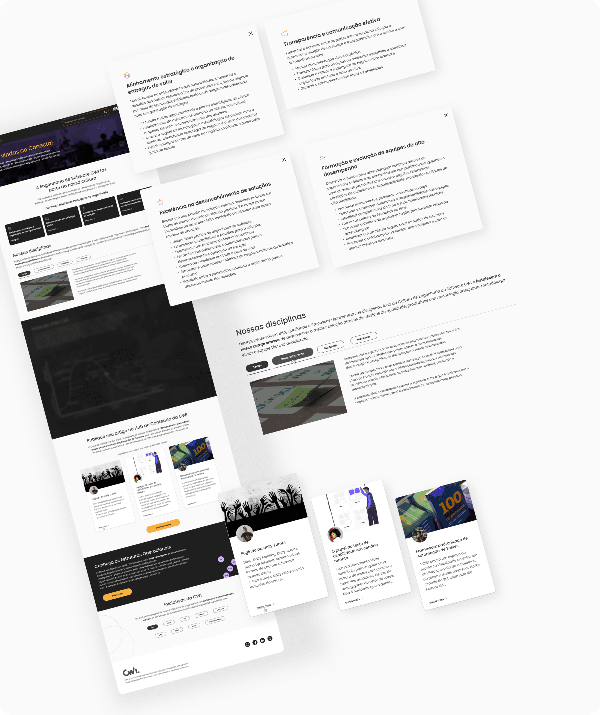
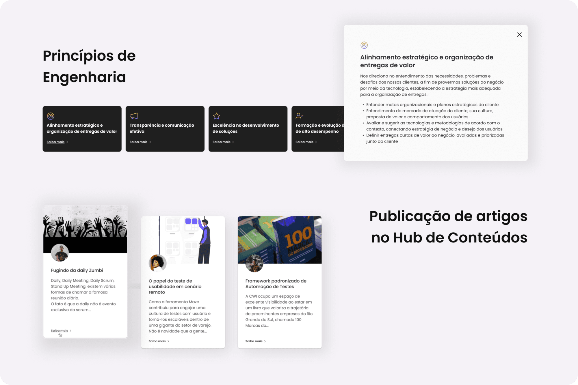
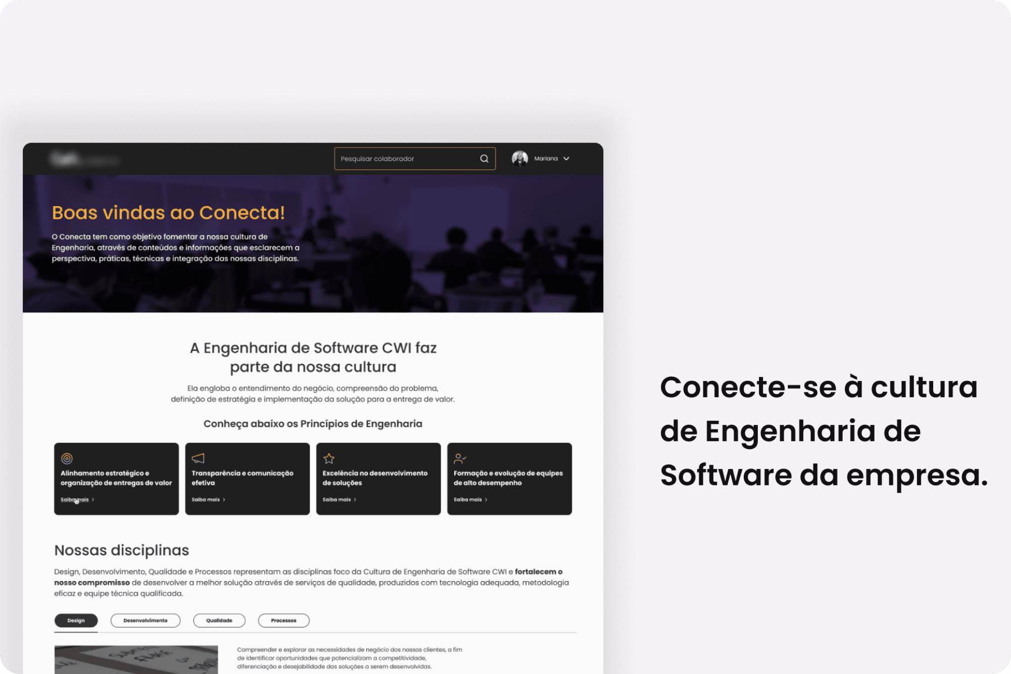
This project was developed for an internal platform at CWI Software called Conecta. Its goal is to foster an engineering culture through content and information that clarify the workings of various company disciplines, such as Design, Development, Quality, and Processes.
I worked as the Product Designer on the project for three months, collaborating with a Product Owner (P.O.), Agile Coach, QA, and Front-end/Back-end Developers. I conducted research to determine which types of content employees wanted to see on the page and which existing content should be kept or removed.
Problem
The homepage provided resources on engineering culture and information about how the company’s various disciplines operate. However, it featured an outdated layout, an obsolete information architecture, and content that did not clearly communicate the platform’s purpose or functionalities to users.
Process
After understanding the problem and the stakeholders’ expectations, I began the Discovery phase using card sorting, surveys, and desk research. I then incorporated the feedback to build the wireframe and conducted a usability test with 18 participants, achieving an 80% satisfaction rate for the proposed homepage. Finally, I created a high-fidelity prototype.
→ Card Sorting
Evaluate the information architecture
Determine which content is useful and which is not
Preparation for the workshop
In the meeting invitation, I provided detailed instructions about the card sorting activity, as well as a link to the old homepage. This allowed participants to review it beforehand and come prepared with ideas and opinions.
About the Workshop
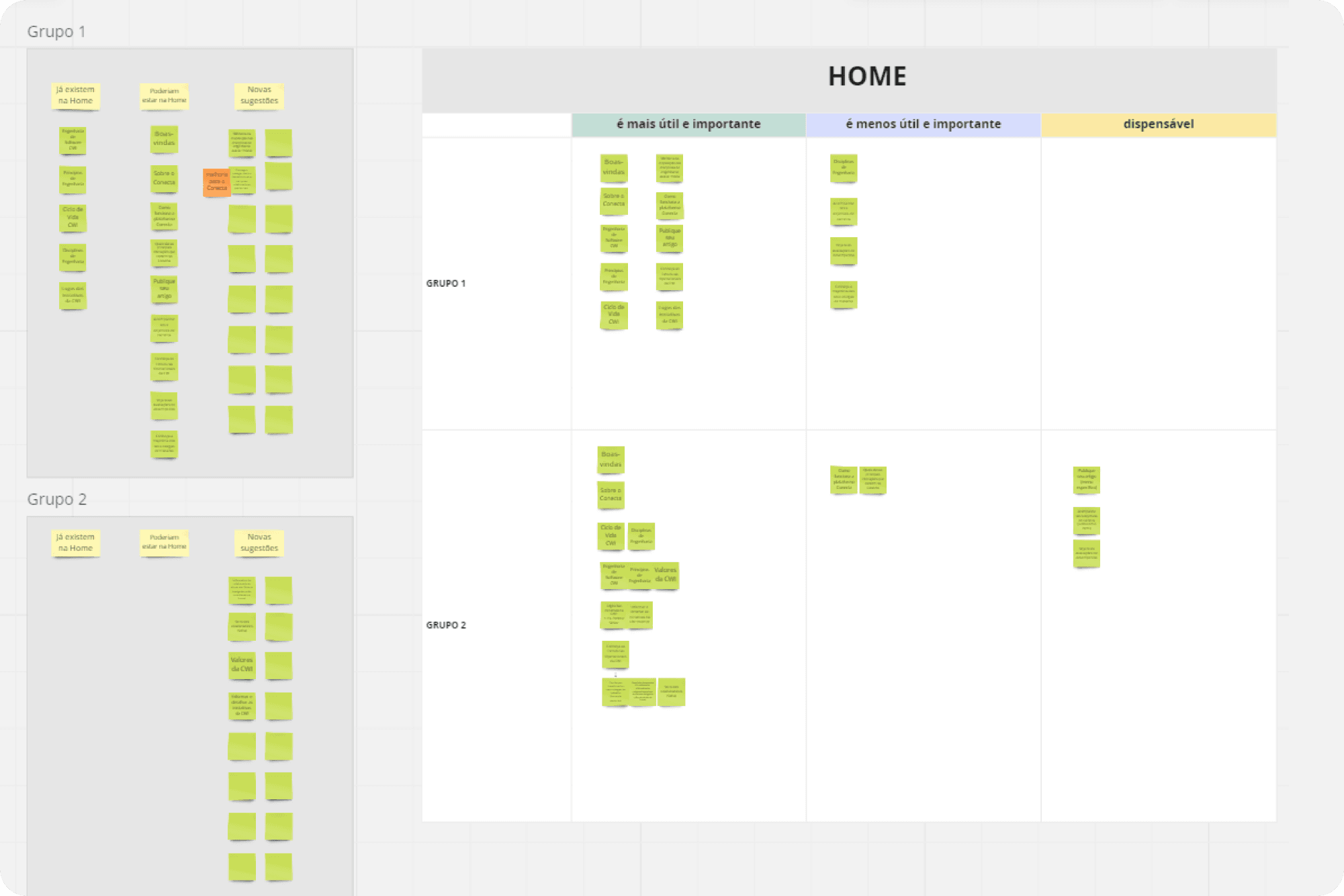
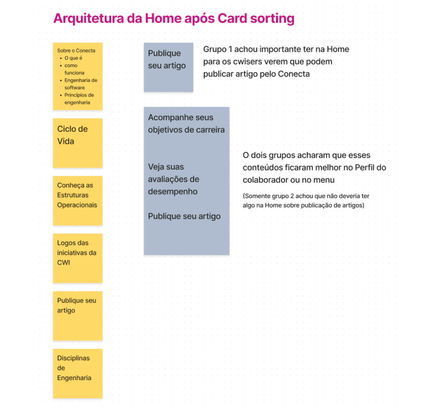
🔶 Objective: Understand the taxonomy and information architecture employees wanted on the homepage, considering both current content and new ideas to add.
🔶 Method: Participants were split into two groups to organize Post-its into three categories: “Content Currently on the Homepage,” “Could Be on the Homepage,” and “New Suggestions.”
🔶 Process: Each group dragged their Post-its into the main “Home” grouping, where three subcategories were available: “Most Useful and Important,” “Less Useful and Important,” and “Not Needed.”
The groups had 15 minutes to arrange the cards and discuss
I observed each group to gather feedback
Afterwards, everyone reconvened in the main room to present their insights
Participant Feedback on the Old Homepage
“It was odd to see only company initiative logos; I think there should be a description of what that section is.”
“We had doubts about where to publish articles, so a button on the homepage would be helpful.”
“I think it’s important to have a welcome text, followed by an explanation of what the platform is.”
Discoveries and recommendations
From user feedback, I noticed that they didn’t understand the platform’s purpose and felt that certain information was missing—like how to publish articles and details on the company’s operational structures. Therefore, I continued my research with additional objectives, including:
🔶 Understanding how each section on the Homepage could be structured—featuring CTAs, descriptive text, and more playful explanations.
🔶 Further exploring what employees would like to see on the Homepage.
→ Questionnaire
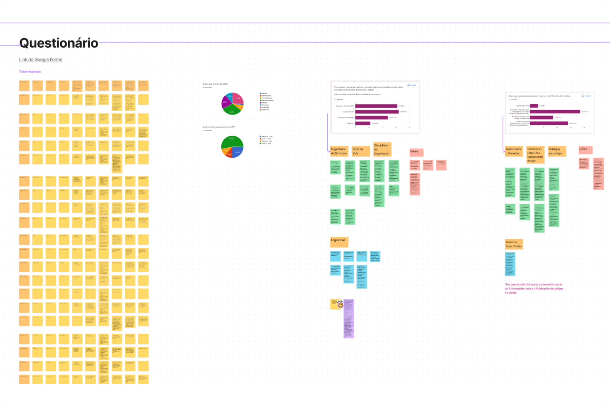
To gain deeper insight into what employees wanted to see on the Home, I designed a questionnaire. The questions aimed to clarify which existing content on the page should be kept, and—based on the feedback gathered from the card sorting activity—which new content might be included.
Questions:
How long have you worked at CWI?
What is your area of expertise?
What is your position?
Thinking about the current Home, which of the options below do you think are useful and should remain? (Choose up to 2)
Explain why the options you chose in the previous question are useful and cannot be removed from the Home.
Which of the options below should be on the Home? (Choose up to 2)
From the options you chose in the previous question, why are you interested in each section?
If there is anything else you’d like to add about the Home or the platform in general, please share!
Findings and recommendations
The responses were exported to FigJam, which made it easier to spot patterns. For Question 4, the most popular choices were “Software Engineering,” “Lifecycle,” and “Engineering Disciplines.” The open-ended responses from Question 5 were then compiled and analyzed. This method was repeated for the remaining questions.
Participant feedback highlights
“These main topics reflect the CWI way of doing things. Together, they convey the quality our company delivers to clients.”
“They make it easier to access CWI’s pillars and can be very useful, especially for new employees to understand the organization.”
“They are more appealing to new employees, helping them get to know CWI better.”
“Publishing an article is a very interesting challenge; it helps professional growth. This can encourage people to develop themselves in the medium and long term. It also benefits CWI/Clients, and understanding the operational structures is crucial to knowing where to start when you need something.”
Based on these survey results, it’s clear that Conecta’s users want a better understanding of the platform’s purpose and how it can be beneficial to them. They also showed interest in learning how to publish articles and how the company is structured operationally, including the roles of managers, leaders, clients, engineering leads, and solution engineers.
→ Desk research
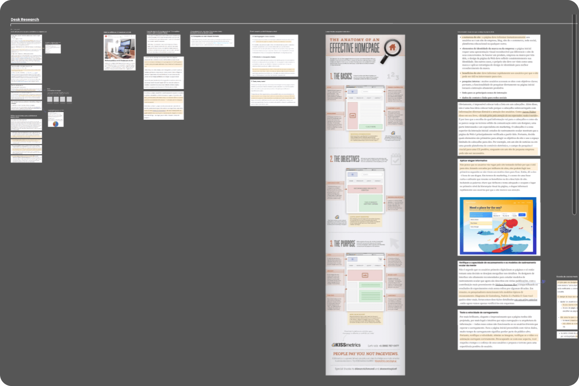
Gathered references on how to design a Homepage following Design and UX best practices.
Examined how current Homepages are structured.
Reviewed issues identified during the heuristic analysis (previously conducted on the entire platform).
→ Consolidating the research data
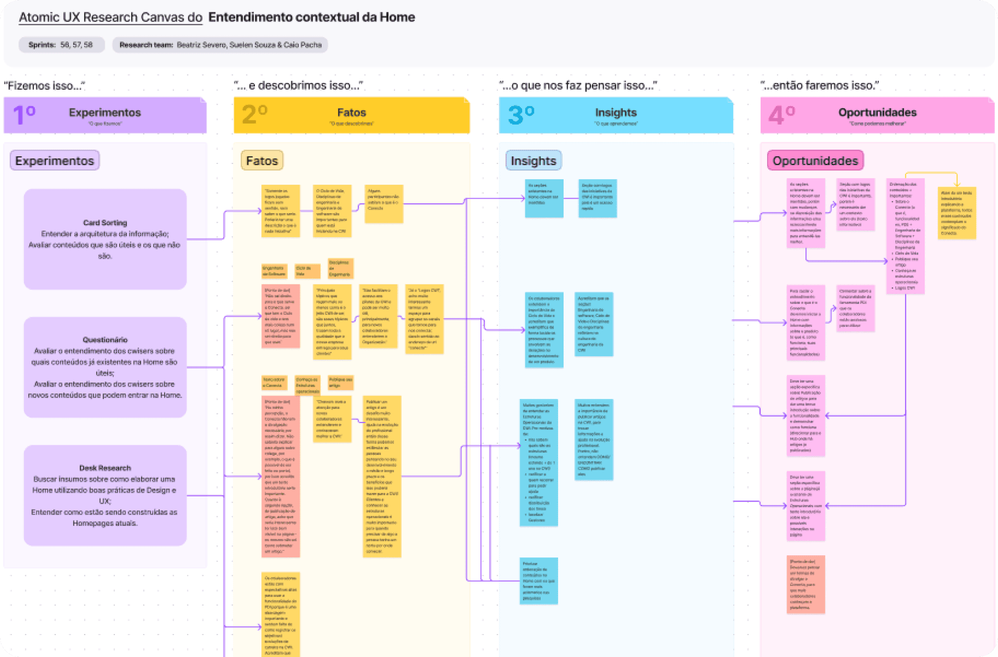
To gain a clearer picture of how the Home could be improved—and to effectively communicate the research findings to the entire team—I used the Atomic UX Research Canvas. This canvas is divided into four quadrants: Experiments (Research), Facts, Insights, and Opportunities. It served as a centralized resource where all collected data was recorded throughout the research process.
→ Ideation
Sitemap:
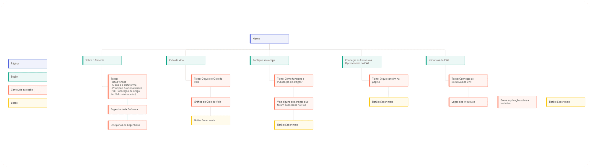
The ideation phase began with creating a sitemap to organize the new information architecture for the homepage.
Moodboard:
After that, I gathered references for layout and content structure.
→ Wireframes + Usability Testing
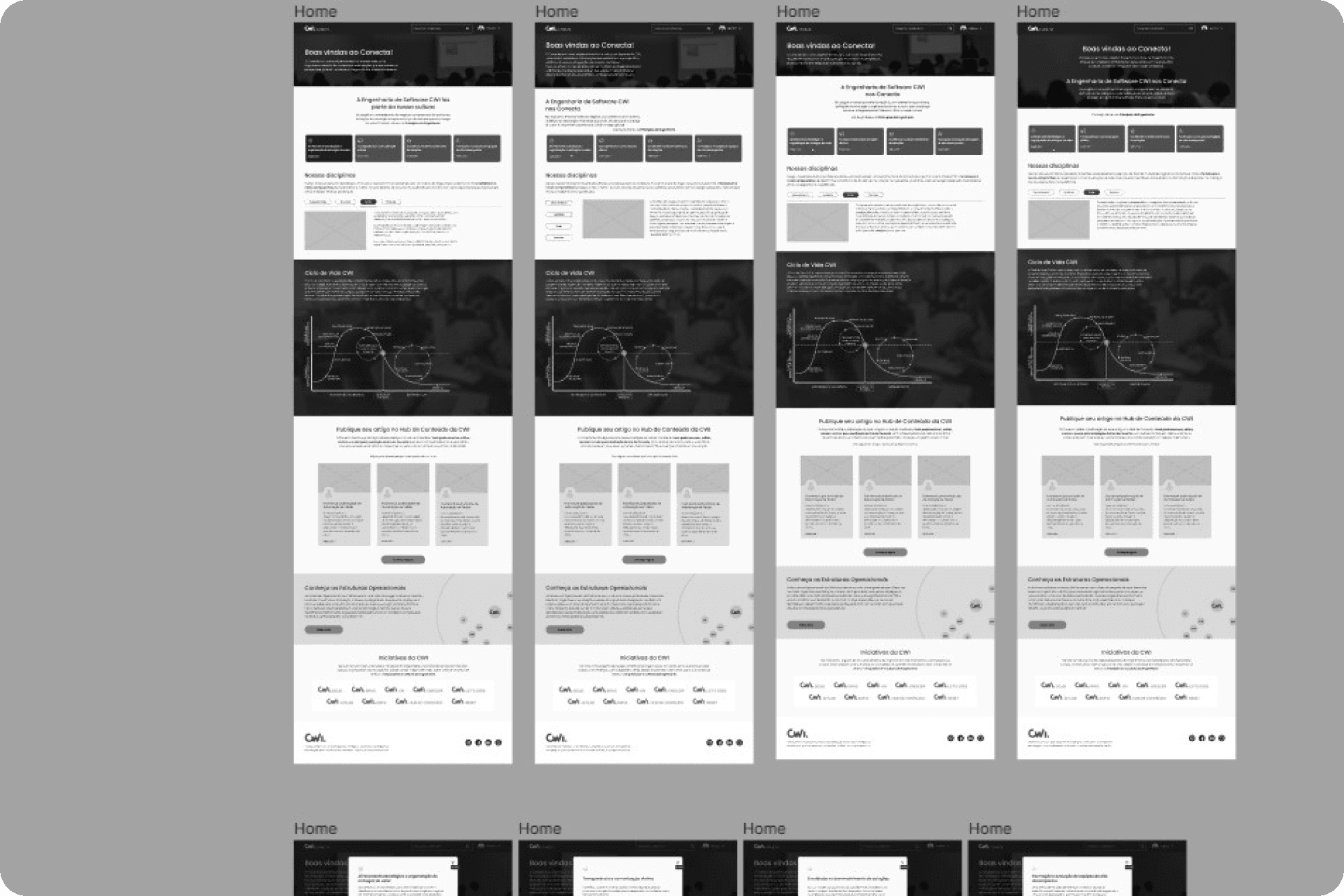
In addition to building the wireframe, I conducted a usability test to verify if the proposed new homepage aligned with employee requests gathered during the research phase. The results were very positive—approximately 80% of participants understood the platform’s purpose.
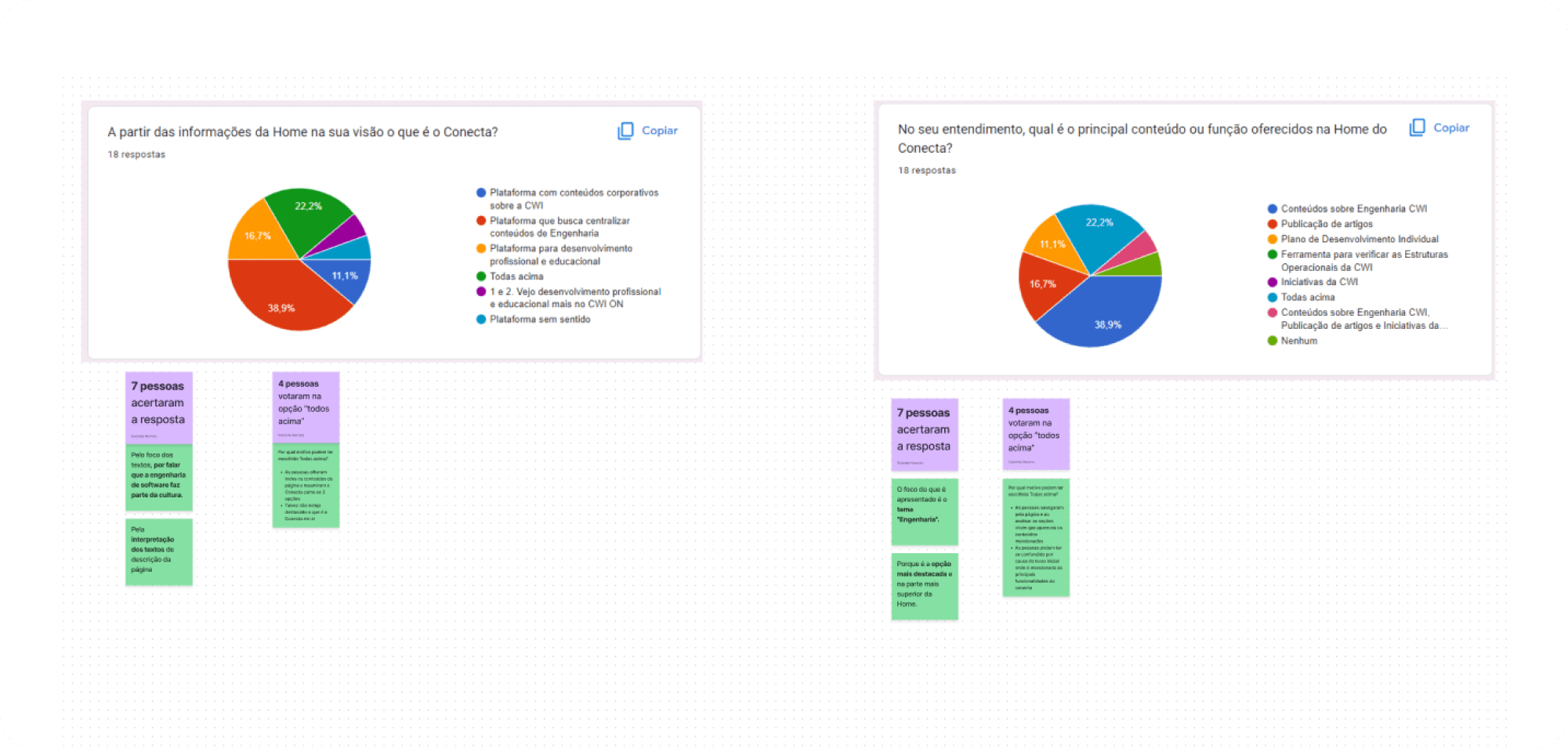
Employees understood the platform’s purpose
Employees identified the main content on the homepage
→ Prototyping